14th January - 14th February 2009
John McLean:
Monotypes, Screenprints, Woodcuts, Drypoints and Carborundum Etchings
biography
paintings 1970 - 1999
paintings 2000 - present
sculptures
prints, works on paper
new work
archive
John McLean: Monotypes, Screenprints, Woodcuts, Drypoints and Carborundum Etchings
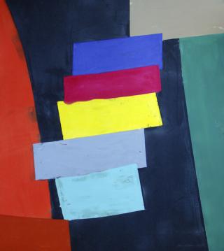 The Scottish abstract artist John McLean turns seventy at the beginning of 2009. Poussin’s print show is one of several exhibitions coinciding with his anniversary; there is also a monograph, the first on the artist, being published by Lund Humphries. The exhibition at Poussin shows McLean unaffected by these events and continuing to produce celebratory, intensely enjoyable abstract work. His images attain a unique and immediately registering purity. Their shapes dance across the paper, revelling in and generating, as he has it, a “song to colour.” The range of prints and print-making techniques in the show testifies to McLean’s continuing inventiveness and desire to expand and clarify his expressive range. They join his explorations in painting, in sculpture and a recent enthusiasm for stained glass, discovered as part of a commission to design a window for Norwich Cathedral. Full steam ahead!
Notes on the prints by John McLean
Screenprints are made by pressing thick printing ink through taut, fine silk with a squeegee. The fabric is held by a frame, a little above the paper being printed on. The pressure from the squeegee brings the screen in contact with the paper as the ink is pushed through the silk. You mask off on the screen or the paper where you don’t want the ink to land. The more colours and tones in the print, the more screens you need.
In the first prints I made with Kip I was keen not to ape painting. Most painters’ prints use many screens for one printed brush stroke, to get feathered edges of great subtlety, like real brush strokes. But the essence of screenprinting seemed to me to be just slapping down flat zones of colour. I gave Kip collages of self coloured paper; each work had one complete rectangular sheet of a colour in it, at least one scissor-cut other colour and a third with a torn edge. I played curve against straight and there was plenty of diagonal movement. What I thought was a direct and therefore simple approach proved the most awkward Kip had ever had to deal with; he had to cut away that bit of every shape being overlapped and make the overlapping shape fit that void exactly, a feat of registration only a master can achieve.
The first of these prints was part of the Jesus College Quincentennial Portfolio and the next ones we christened the Mountjoy Suite after the Barbican block into which Jan and I had recently moved, and which in its turn is named after Shakespeare’s landlord when the playwright lived in the district - a milliner called Christopher Mountjoy.
Some years later we made a series of monotypes using the silkscreen. What is astonishing about this apparatus is whatever you put down first on the screen, no matter what you let drop on top of that bit of colour, only the first colour is what appears on the paper after you have swept the squeegee across. I was intrigued by the way the squeegee pushed colours from elsewhere in the layout through tiny breaks in other colours. There was an instant pictorial cohesion rather like a woven rug. That is why I keep on doing the monotypes: no one can put paint like that on paper with brushes. By monotyping, the time element in painting is defeated. All the colours in the print are on the same screen; so with one sweep of the squeegee the work suddenly appears, complete. Each print is a revelation, not an accumulation. I think part of the appeal of Morris Louis’s stripe paintings was their coming close to this. Louis ran can-fulls of paint along temporary runnels in the bare canvas that he would stretch later. The paint went on just as if he was squeegeeing a load of ink across a screen.
The next collaboration was with bits of medium density fibreboard (MDF) cut into simple shapes using Kip’s guillotine for straight edges and a jigsaw for curves. I arranged the shapes in what to me was an exciting way, according to the colours we rollered onto them. Then we tried printing these inked up shapes onto a light Chinese paper made of rice husks. Into Kip’s etching press we fed a backing board with the MDF pieces, inked surfaces upward, sitting on it, and the rice paper on top of that. It was like putting the ensemble through a very loose mangle. What we got was all the more of a triumph because of the treachery of the process. Imagine trying to print on toilet roll with pieces of jigsaw. It takes a virtuoso artist like Kip to deal with such stuff.
Next we did a couple of carborundum etchings. I brushed p.v.a. glue onto a steel plate to make some shapes. When the p.v.a. was still tacky, Kip sprinkled carborundum dust onto the plate, blowing away the excess and leaving the p.v.a. with powder on it to dry – a matter of weeks, not days. You can put several shapes on one plate so long as there is room between them to clean away the ink from the edges of the shapes. The rough carborundum surface holds so much ink, the handiest tool to work the colour in is an old toothbrush. Some carborundum prints, Gillian Ayres’s for example, are like reliefs, they are so embossed. Mine turned out relatively flat, but that suited what I was trying to do.
Finally there are drypoints. I used a hard steel point held like a dagger, to score deep lines on a zinc plate. And I made some shaded areas using roulettes – abrasive metal rollers fixed to wooden handles. The ink gets rubbed into the resultant grooves and pitted surfaces, then wiped clean from the rest of the plate and the print is run, on damp paper, through the etching press, this time under much greater pressure than for the pieces of MDF. I have coloured nearly all these drypoints by hand. But besides these we made some where after the black ink is printed, the zinc plate is replaced with a piece of transparent plastic, exactly the same size, with a couple of colours on it, one with a groove scored through the darker colour. When the plastic has gone through the press on the same paper that already has the drypoint impression on it, that groove registers as white – the bare paper glimpsed through the colour. So I have black lines, white lines, shaded areas and coloured flat zones. The beauty of the transparent plastic is that when you lay it on the black and white drypoint you can see exactly where you want to put the areas of colour in relation to what is already there. The areas to be coloured are marked on the plastic with an indelible pen; so those areas can be re-inked in pretty well the same place each time a fresh print is made.