2nd December - 16th December 2006
Opening: 2nd December 2006
Poussin Review 2006:
Recent British abstract painting and sculpture
Douglas Abercrombie
Alan Gouk
Robin Greenwood
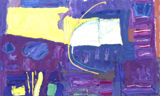
Geoff Hollow
Vanessa Jackson
David Lendrum
John McLean
Mali Morris
Fred Pollock
Geoffrey Rigden
Tim Scott
Anne Smart
Peter Startup
Paul Tonkin
Poussin Review 2006: Recent British abstract painting and sculpture
 Negotiations with Imaginary Architectures in New York, Paris and London
A personal critique of abstract painting by Robin Greenwood, sculptor and a founder/director of Poussin Gallery.
A significant number of the artists shown so far at Poussin are what one might (perhaps rather indelicately) term British “middle-generation” abstract painters. By this I simply mean the generation that came after and were directly influenced by the first serious grouping of fully-fledged abstract artists in this country, which included painters such as Patrick Heron, William Scott and Terry Frost. Many of this so-called middle- or second-generation of artists have been, and to some extent still are, under-represented in public and private galleries. The reasons for this may be numerous, but in retrospect seem more to do with fashion than with quality. Perhaps partly because of this - because we could so seldom see the abstract art we wanted to see - we felt their work deserved to be looked at more closely, and credit given where credit was overdue, from as far back as thirty years or so. Our very first show in September 2005, Mainstream Abstract Painting from the Seventies: Abercrombie, Gouk, Rigden, and the shows that followed, were conceived to some extent to redress this balance. But it was certainly not out of nostalgia for any previous state of art that we started out at Poussin by looking back. We felt that we could shed some light on the condition of abstract painting and sculpture here and now by interspersing new work with a large measure of older, more formative work that connected us, in a modest way, into the history of abstraction. We anticipated - and we got - a lot of surprises and a lot of pleasure from rediscovering this work, and seeing it under the good viewing conditions afforded by Poussin. Many of our assumptions were overturned, because much of this work turned out to be even better than we remembered it. It turned out to be very good indeed.
It is not a coincidence that some of the painters and sculptors now showing at Poussin originally met, worked and exhibited together at Stockwell Depot studios back in the Seventies. This was one of very few places at that time where plastic and spatial values were held as pre-eminently important, where visual impulses were pursued in preference to conceptual ideas, and where some kind of an objective critique was able to prosper. And whilst by no means all the artists Poussin now shows were associated with Stockwell Depot, those values are very close to the ones we wish to promote at Poussin. I don't want to idealise Stockwell Depot - there were all sorts of critical and interpersonal dysfunctions which often made it a difficult environment to be in for some artists. Neither did it endear itself to critics in the UK, although it was the subject of quite a lot of interest from the American critics Greenberg and Fried. But the place had an edge to it, a commonly felt direction and some closely shared interests - it was distinctly not a rag-bag of differing artistic persuasions like many colonies of artists are. It was quite a tough place dominated by some pretty tough personalities, and whilst most of the artists who came and went, who worked there or just exhibited there, were never part of a coherent group, they did seem to share a common language. It was prevailingly a visual language, the language of abstract painting and sculpture.
Many of them also shared an admiration for the St.Ives painters mentioned above, but they were initially perhaps even more influenced by Abstract Expressionists like Pollock, Rothko, Still and Hofmann and a following generation of Americans such as Noland, Louis, Frankenthaler, Poons and Olitski, whom many of them met through the inspired mentoring of the sculptor Anthony Caro. (In fact it should be noted here that Stockwell Depot was primarily set up as sculpture studios, and it was the sculptors who, under the auspices of the abstract sculptor Peter Hide, often dominated the agenda at Stockwell.)
So, this then is the background, sketched in brief, (and the subject, we hope, of further study at Poussin) for some, not all, of the artists Poussin has included here. It was certainly the background to the painters in our first show, Abercrombie, Gouk and Rigden. In May of 2005 I had written for the introduction to the inaugural catalogue:
It's “the look of the thing” that counts, and in visual art this is not superficiality. Most advances made in painting between 1850 and 1950 were made by artists who wanted “the look of the thing” more than anything else. The fat, loaded, directed brushstrokes of advanced Impressionism ..... were “the thing” that inspired vanguard artists from first Europe and then America; artists as diverse as the “hot” Hans Hofmann, and the “cool” Barnett Newman.
I had concluded:
If we want more than a “look”..., then we want also to get a good measure of intelligent dialogue out of a work....We recognize one “piece of paint” to be in an intelligent relationship with another “piece of paint”, and one passage of structure to lead to another.
Douglas Abercrombie, Alan Gouk and Geoff Rigden are three artists of a painterly persuasion who were, back in the Seventies, big on the “fat loaded brushstroke” and the “look of the thing.” (In fact Gouk's brushstrokes in these works from the Seventies were very big indeed). These painters were also, then as now, especial admirers of the work of the American emigre painter Hans Hofmann, and he was, for a number of the artists at Poussin, one of the most influential of that important group of American abstract painters. I'm a fan too, and on the rare occasions I have seen it, I have always found Hofmann's painting to be very exciting. He combines a European sensibility in painting with a grand American sense of ambition; and for me, his mature work takes on a larger-than-life physical presence.
New York, June 2005
Well, Hofmann is the ultimate “piece of paint” painter, and come June 2005 I'm stood in the new MOMA in front of the ultimate “piece of paint” painting, his Cathedral of 1959. Those ochre/yellow rectangles are banging away across the bottom, and the reds are hanging over blue across the top, and the canvas literally is sagging under the weight of pigment - not so much a “fat, loaded brushstroke” as one concrete piece of colour-stuff up against another, and another. And, yes, it is all strong and powerfully visual and real, and I am getting off on the imposition and drama and colour of it, particularly the variations around the primaries.
Except I'm not really, because I'm distracted. I've noticed that S. has moved on, and isn't sharing my moment with Hofmann any more. She's hardly looked at it; certainly not long enough to give it its due, this being a masterpiece of abstract painting and all. She's moved on to the next thing on the wall, which doesn't look too interesting. It's a big thing under glass, and the glass is reflecting light from a window, so I can't really see from where I am in front of Cathedral what it is that is so important that it can take you away from a very good Hofmann. And I am certainly not ready to move on, so I say rather impatiently “What is it?”, and she says “Come and have a look”, and now I'm really annoyed because my concentration is completely blown.
It turns out to be Matisse's Memory of Oceania 1953. Quickly, I'm persuaded to let go of the Hofmann, and give myself up to the influence of the more pro-active forms of the Matisse. It just straight away seems much more engaging, less confrontational. All the parts are different sizes and shapes and orientations, but are in some special kind of coordination of activity. There is a lot of “uplift” and openness about it, and a great deal of what one might lazily describe as movement, but that is not really a correct description of what is going on. It is not the case that the elements of this work are in movement, and certainly not that they are describing movement, as in, say, some Constructivist or Futurist illustration of process. What these elements seem to be doing is allowing us the space to move, in amongst them, allowing us imaginatively to negotiate a route from one place to another, by different ways and different means, sometimes traversing open spaces, sometimes travelling through the forms themselves. The arrangement of forms not only invites us to participate, but carries us around and about without obstacle. Importantly, we move in something rather more stimulating than a two-dimensional space.
Despite the framing effect of a coloured border to the work, I am less aware of the actual boundaries of the object than I was with the Hofmann. In fact, I am much less aware of its “objecthood” all together, because what holds my attention from the start is the unexpectedness of certain spatial relationships, which despite being at the time new to me, immediately seem believable. It is a great feeling, to be surprised and almost simultaneously convinced of a new and imaginative spatial arrangement. It's not an unfamiliar feeling, of course - I get it whenever I look at a really great figurative painting.
.................
Memory of Oceania is negotiable, in all its parts, across all areas of the painting. This is all achieved visually and abstractly; no anecdotal prompting, no representational trickery, just these simple but athletic colour-forms, summoning from out of their literal flatness a rounded spatial experience, a physical journey for the eye. In some ways, the components of the painting - simple geometric or hard-edged shapes in near-primary colours; red, green, yellow, orange, blue - are very similar to the elements of the Hofmann. But whilst the Hofmann presents itself as a spatially active wall of colour, pushing and pulling against the picture plane, the Matisse offers a vision of a much more plastic and three-dimensional world. Was it the best thing I saw on my New York trip? Possibly not. It had to compete with a lot of things of the first order, like several things at the Metropolitan Museum, and, memorably, a masterpiece of a Van Dyke at the Frick. But without a doubt it was better than the Hofmann next to it, and better than other Hofmanns we saw later. I would care to say now that it's the best abstract painting I've yet seen.
Returning to the Hofmann for a moment, it is worth asking whether the slabs of orthogonal paint that jostle together, more or less (as in many Hofmanns) in reiteration of the rectangle of the stretcher, and reinforcing the “objectness” of this rectangular object, are in “intelligent relationship” with one another, or are they just literally next to each other? It seemed to me at the time, and reflection has not changed my opinion, that the relationships between parts in the Matisse are of a different order to those in the Hofmann. They are superior. Is the painting as physically “present” as in the Hofmann? Maybe not, in a literal sense, but it is profoundly physical. Even though there is a genuine “touch” to how it is constructed, and you get a sense of the delicate physicality of the coloured paper cut-out shapes, this is not really what I mean by the physicality of Memory of Oceania. There is more going on here, and it's very much about the spatial construction of the work - its architecture, how it is built and thought about - and it's something that the Hofmann doesn't really have. Or, at least by comparison with something as great as the Matisse, might be said to have less of. It's a physicality of a different order, perhaps of more significance because it is less literal.
When the qualities of Matisse's late cut-outs are discussed, colour is often cited as their highest achievement, and always insisted upon as Matisse's biggest contribution to modern painting. I'm as big an admirer of Matisse's colour as anyone else, but what strikes me more often, not just with the late cut-outs but with work from all periods of his career, is the inventive spatial organisation of his paintings. This for me is at the heart of Matisse's huge originality. Sure, the organisation of his paintings is in part dependent upon colour. But Matisse is inventive at the most basic level with the structures of his painting. Think for example of Still Life with Eggplants 1911 with its upturned floor and wall framing a more rounded still life against a screen, this reflected in a mirror; which corresponds across the painting with a view through a window of a landscape, which is like a painting; and then a more distant space than that (but within the building) of a glimpse over the screen into another room/space. It's as complex as Las Meninas.
Or how about The Morrocans, apparently simple, but actually as sophisticated a spatial proposition as you would care to have in a painting, all perfectly negotiable - with manipulations of the space, yes, but without obstacles or complete disruptions. It's as complex and at least as comprehensively realised as (and inspired by?) Manet's A Bar at the Folies-Bergere , which is itself a tour de force of spatial inventiveness. Matisse takes little for granted in his major works, and his architectures invite us to negotiate the paintings in unfamiliar ways, to feel our way around them. This is a very great thing indeed, and what much great painting has in common. It is, for me, what makes Tintoretto and Rubens and Constable and Cezanne all great painters. We are invited to negotiate their invented worlds, on their invented terms, and without suspending our disbelief, because these things are made real and anew for us. And whilst so much second-rate art flags up early on what it wants us to feel, great art gives you the room to let you discover for yourself your own feelings about the situation in which you find yourself, and does so through the most direct of expedients, the imaginative grasp of our own physicality.
.................................
Before going any further with this, I want to say that I agree with those who consider Hofmann to be the best abstract painter to date. He is very, very good indeed. He's just not as good as Matisse, who is great. But Matisse is a figurative painter, even though one must read Memory of Oceania as an abstract painting. I don't think there is an important contradiction here, and I don't really want to get into the figurative v. abstract thing on this level, because it's more interesting to work out why the Matisse is better than the Hofmann. It seems to me that this difference is the very thing that makes great abstract art and great figurative art all of the same order of experience, all “intelligible in terms of the past”, as Greenberg put it. But I did want to say that my high regard for Hofmann is undisturbed by this comparison. In fact, what sets Hofmann above and beyond many fellow American Abstract Expressionist painters of quality, like, say, Newman or Rothko, and even Pollock, is his (Hofmann's) invention and re-invention of the architecture of his painting, his unwillingness to resort to a formalism devoid of content, his refusal to go for "format" painting (like Rothko tended towards, and Stella and many others did later on) over real discovered form.
If Hofmann's architecture is found to be less pliable, less resilient than Matisse's, then at least he had an architecture - and a credible one at that - which remains way beyond the means of most abstract painters. Maybe Hofmann's "push and pull" is too crude a conceit, not quite a fully rounded, three-dimensional kind of construct. It is still better than flatness, which many commentators on (including, regrettably, Greenberg) and practitioners of Modernism have promoted as a positive quality of modern painting (which is tosh). No, Hofmann is not downgraded by this comparison with Matisse, it is Matisse who is re-evaluated because of it - upwards, of course. We'll come back to the Hofmann/Matisse thing later. Meantime I want to explore this idea of "negotiating" a painting.
Paris, April 2006
We are at the Musee d'Orsay, the Cezanne and Pissarro, 1865 to 1885 show. There are two particular paintings from this exhibition, both by Cezanne, that I want to talk about here. The first is La Cote des Jalais, Pontoise 1879-81, which I don't recall seeing before. It is a particularly good work to consider from our point of view of "negotiating" a painting, of getting around it. For a start, it works right across the full extent of the canvas, and refrains from fading out towards the edges (and centralising the motif) in the annoying way that some late Cezannes do. It has that most reliable of devices, namely a path leading us in from the bottom edge of the canvas toward the middle foreground. This path, however, is shunted off to the right-hand side of the bottom edge, and is already itself some way away from us. We are certainly not already "on" the path, in the way that we are with, say, Pissarro's painting of the same name of 1867. We are not "on" that path at all, but we are "on" the hill upon which the path is situated, and the hill is pitching us forward, downward, into the painting.
We have a choice. Rather than take the path, we are more likely to opt for a faster entry down the field heading toward the bright curve of the road. I was reminded of an exceptional Cezanne I saw some years ago, at Wildenstein's in Bond Street, Landscape at L'Estaque. It was part of the Readers Digest Collection, and it had some serious opposition in that show. It is only a smallish canvas, and it was close to a fabulous big Monet Water Lilies to which it could offer no contest from a distance. But on closer inspection it accorded a wonderful pitch forward down a slanted hillside, this time under a low canopy of olive trees, with glimpses of the sea to draw one forward and down and in. In terms of spatial invention, it left even the Monet for dead. The Pontoise painting by Cezanne has by comparison, beyond the pitch of the hillside, a more extensive prospect, and can be negotiated by a number of different ways and means. We can return to this painting a number of times, and still be discovering new means to negotiate it by. We can get to the middle-distance of the village via the bend in the road, which holds the centre of the painting. We can head up the left of the canvas to the water, round the back of the trees that skirt the road, and thus attain the far end of the village before looping back to regain the road. We can even cross the road on the right and make for the far side of the valley, by way of the singled-out house to the right of the main group of buildings. Faster than all of these, we can attain the highest ground, the furthest farmhouse, by ascending with the vertical poplar trees that rise from the near side of the road, and go right on up to just touch with their tips the upper extent of the painting.
None of this is about realism. Cezanne's painting is not realism. The transitions in Cezanne's painting work because of being able to negotiate successfully the form given to the paint, in a manner that may, possibly, parallel how we would negotiate the landscape, but does not by any means imitate it. In fact, the form of these transitions in the paint could downright contradict the literal form of the landscape, but in any event will almost inevitably short-circuit it. In a successful painting such as the Pontoise work, one piece of paint, one passage of structure, leads us to another, but we retain our freedom of movement and a choice of which direction to follow. Any notion that the artist has a controlling "message" for us is put paid to by these liberties. With art of this order we are given the freedom, and of course the ensuing hard work, to fend for and feel for ourselves whilst the fabric of the imaginary space is woven for us. This is not a confrontational experience, but a free and fair "negotiation".
............................
There was an earlier painting by Cezanne - also done in Pontoise - in this show, which was of an altogether different nature. Paysage aux Environs de Pontoise 1875-77 is both an interesting and a disturbing work. At the time, it ran through my head that I was looking at the first ever abstract painting. This is nonsense of course, but whilst I simultaneously was recognising the work as a direct stylistic forerunner of a number of Matisse landscapes (from Collioure), I was also realising that I could not negotiate this painting in anything like the same manner as the later Pontoise work, or indeed many of the other Cezannes or Pissarros in the show. The components of the painting were "adrift" somehow, in a manner that reminded me of a lot of abstract painting. (I should point out that the Matisses mentioned as being possibly derived from this work do not suffer from this disconnection.) These components in the Cezanne were not locked into the physicality of the landscape, which means in our case the physical form of the paint. They were not really, in the terms of this discussion, negotiable. The forms were kind of floating about, "abstracted", whatever that means. It was interesting, but I was disturbed by it, coming as it did from Cezanne. I didn't get it.
London, June 2006
I just have to compare the feeling of being cut adrift by that second Cezanne with the consummate connected-ness of the best work in the current Constable show at the Tate at the time of writing to know that I'm very troubled by my recollections of that Cezanne, and by implication with the state of much abstract painting. One of the great things about Constable is the number of options he gives you to get into a painting. The Hay-wain is one of his simpler constructions, but even here we are presented with a range of opportunities. When it comes to the more sophisticated work, like View on the Stour, Near Dedham or Salisbury Cathedral from the Meadows, we have almost complete freedom to roam, and with complete confidence that we won't be falling down. I would go so far as to say that I think Whitehall Stairs is a most ravishing essay in structure, comparable to anything, in any field of human endeavour, that I can think of. It is surely the case that no abstract painting gets anywhere near this level of resolved spatial complexity, and nowhere near this level of feeling through the structures available to vision ( Patrick Heron's "reality of the eye"). Sure, you can get around a lot of abstract painting pretty easily, without too much fuss, but I guess that's the point, it's a little too easy; it's usually easy because it's flat; and when it's not flat and easy, it becomes non-negotiable. This is beginning to sound like I think abstract painting is very unsophisticated compared to the best figurative art. I guess that is true, because I can see no reason for not making such a comparison between the two, and no conclusion possible from such a comparison other than that abstraction does not yet get near to matching the achievements of figurative art.
By coincidence, at the time of writing this I saw the other day a very fine (albeit awfully hung) show of Heron's beautiful abstract paintings at the very same Bond Street premises, now no longer Wildenstein's, where I saw that great little Cezanne all those years ago. That Cezanne haunts me still, and it haunted the Heron show. It acts as a rebuke to all present-day conceits, both in my own work, and in the work of others whom I admire. It was so unassuming and yet so clear in what it achieved, and it achieved a great deal. It communicated directly what it needed to say, it was both so utterly real, and simultaneously so full of invention.
We saw two other Hofmanns on that trip to New York, both at the Met. Both were very difficult to negotiate, unless you accepted at face value the fact that they were flat, literally flat, and that that is how painting is and should be. I can't any longer accept this. These two other Hofmanns were very good paintings, by all the criteria of recent abstract painting, but once you got over the impact of their physicality, of the literal action of the painting which is so demonstrably impressive in Hofmann, you were not left with much to hold on to, you were adrift again. I will repeat for a second time that I think Hofmann is a really good painter. But I now think that to make progress abstract painting must get beyond him in a way we have yet to fully comprehend, but which perhaps can be presently only inferred by a direct comparison with the best figurative art. Some abstract art, including Hofmann's, now begins to remind me of early Italian painting of the Fourteenth Century, Duccio and Giotto, or of even earlier icon painting. Colourful, beautiful for sure, but rather stiff, lacking spatial sophistication and ambition, and to some degree rather conservative in the composition of its architecture. It is worth recalling that Hofmann is essentially cubist by persuasion, despite his high colour, with all the flattening and faceting inherent in that approach, not to mention the centralising of the image that transfers from many of Picasso's motifs into Hofmann's work (and then becomes simplistically paramount ad infinitum, ad nausaum, in the work of subsequent practitioners of minimalist abstraction).
Is this all a plea for a return to figuration? Not at all. Not from one of the founder-directors of a gallery set up to specifically show only abstract painting and sculpture, to the exclusion of all figurative and conceptual work. Not from an out-and-out abstract sculptor, to boot. It is, though, a plea for more rigorous comparisons between abstract and figurative art. And perhaps it is a plea for an attempt by abstract painters and sculptors to take on complexities as yet undreamt of, to wilfully abandon simplistic formats and ideas, so that abstraction, especially abstract painting, can move on a little from where it is now. I might not believe this to be possible, were it not for that Matisse.
Robin Greenwood London, June 2006 c. Poussin Gallery